Mapping with D3: Library of Congress books over time

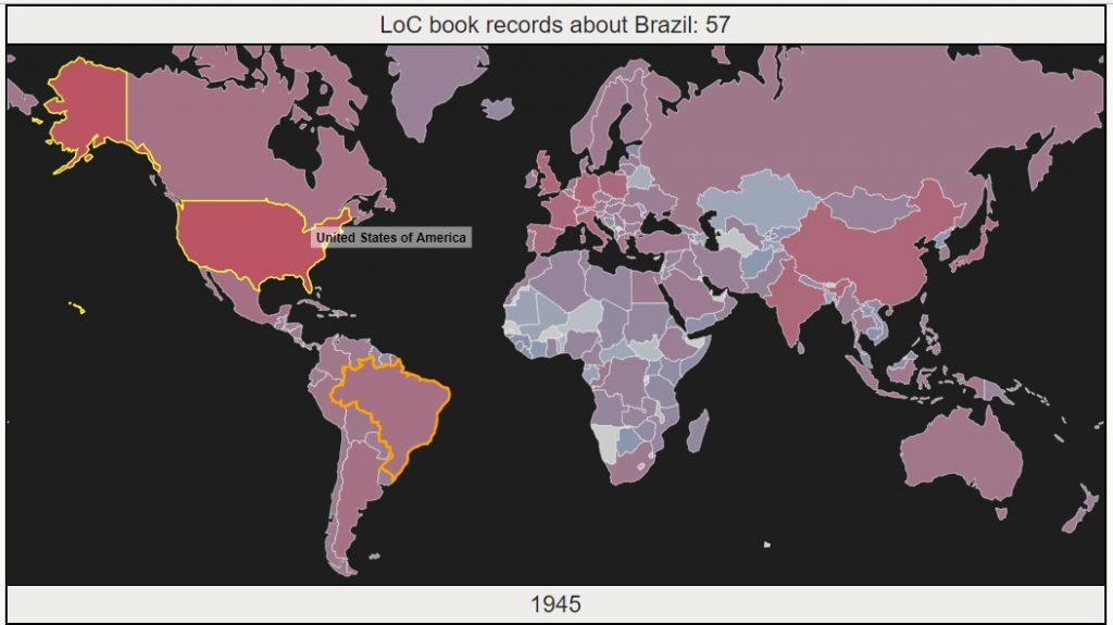
In May 2017, the US Library of Congress made the largest release of digital records in its history – metadata for over 25 million books, maps and recordings. People immediately started making some pretty cool visualizations to explore patterns in the data, or demonstrate the incredible size of the release. This page follows my process of building an animated D3 map visualization, from data cleaning to adding features. Each of the pages below covers one step in the process. Jump to the last page to explore the visualization.

  1. Preparing the Data – Parse massive xml record files, cache and geocode subject locations, aggregate for our visualization.
  2. Basic Animation – Build a D3 map that animates changing numbers of records about each country over time.
  3. Add a Tooltip – Add a tooltip to display country name on hovering. Select a country on click to show record counts for that country.


Still frame of the animated map created in this project.

Using Processing to Visualize Space Exploration

(Read Time: About 3 Min.)

The Challenge:

Could the total distance traveled by a NASA space shuttle have reached Mars? How far did each shuttle go in relation to our solar system? As an inaugural project to get our digital projects studio thinking and managing a project, we used a dataset that recorded the distance traveled by each space shuttle launch from 1981 – 2011 and worked to visualize the total miles traveled for each shuttle as a hypothetical race to the red planet.

Continue reading “Using Processing to Visualize Space Exploration”

Introduction to Network Visualization: Part 2 (Cytoscape)

This post is the second half of a two-part beginner’s introduction to network visualization. The first post outlined preparing a dataset for upload into Gephi and covered how to get started with the styling options and layouts available in Gephi. In this half of the tutorial, we’ll do the same for Cytoscape.

Continue reading “Introduction to Network Visualization: Part 2 (Cytoscape)”

Introduction to Network Visualization: Part 1 (Gephi)

This introductory tutorial to Network Visualization is the first of a two-part series. This first post will provide an introduction to generating network visualizations with Gephi. The second post will be an introduction to Cytoscape. Along the way, we will contrast the interfaces and the layouts available for each platform.

Continue reading “Introduction to Network Visualization: Part 1 (Gephi)”