
This introductory tutorial to Network Visualization is the first of a two-part series. This first post will provide an introduction to generating network visualizations with Gephi. The second post will be an introduction to Cytoscape. Along the way, we will contrast the interfaces and the layouts available for each platform.
Cytoscape and Gephi are both interactive platforms. Both are open source and available for free download online. Cytoscape was originally designed for visualizing molecular interaction networks for biological research, although it is also used for social network analysis. Gephi is frequently used in network analyses related to social science and cultural studies, but also lends itself to other kinds of complex network analysis, including the study of biological networks.
Being new to network analysis and visualization myself, I found Gephi’s interface more beginner friendly: the interface provides clear metrics that allow the user to learn terms and vocabulary as well as gather statistics while experimenting with different layouts. On the other hand, as a Mac user, I encountered issues with installing Gephi 0.8.2 on my computer and am currently still running the program from a disk image rather than my hard drive, which makes saving sessions problematic. Downloading Cytoscape 3.2.1 posed no issues.
Since this is intended as a beginner’s tutorial, we’ll begin with a quick overview of core terms and vocabulary in network analysis. Every network is made up of nodes (also called vertices), connected by edges, which represent interactions. In addition, when uploading a dataset to either Cytoscape or Gephi, you’ll be required to identify both the source and the target nodes. As the words ‘source’ and ‘target’ suggest, these terms reflect the relationship between pairs of nodes. Networks are classified as either directed or undirected, a distinction which relates to the concept of source and target nodes. In a directed network, edges represent a one-way interaction from one node to another (for example, in a visualization representing interactions on Facebook, ‘pokes’ or who liked someone else’s post would be directed edges) In an undirected network, there is no distinction between the connected nodes (a network visualization showing friendships on Facebook would be an example of an undirected network, since these relationships are mutual and have no ‘direction’ as such).
All of the above goes to show that to create a network graph from a dataset, your data file should be divided into three columns: source nodes, target nodes, and interaction type.
For this tutorial, we will be working with the collaboration network of Arxiv High Energy Physics Theory, available via the Stanford Large Network Dataset Collection at https://snap.stanford.edu/data/. This is a sizeable network with about 10,000 nodes and about 26,000 edges.
UPLOADING DATA TO GEPHI
The file ‘ca-HepTh.txt.gz’ will download as a compressed text file. Once you have unzipped the text file, it will require a few changes before you can upload the dataset smoothly to Gephi 0.8.2.
To prepare the data:
1. Once you’ve downloaded the file and saved it to your computer, open Excel and go to File –> Import.
2. From the ‘Import’ window, select ‘Text file’ and click ‘Import.’ Select the file to import.
3. In the ‘Text Import Wizard’ window that appears, select ‘Delimited’ and set the row to 4. Click ‘Finish’ and then click ‘OK.’
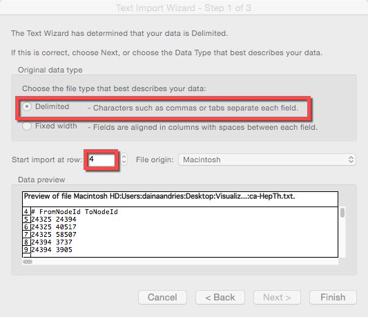
4. In the resulting spreadsheet, change the column names ‘#FromNodeID’ and ‘ToNodeID’ to ‘Source’ and ‘Target.’
5. Add a third column heading to your spreadsheet called “Type.” Select all the cells below in the column range by selecting the first cell, then scrolling to the end of the cell range, then hitting ‘SHIFT’ and clicking the last cell in the range. Type ‘Undirected’ in the first cell, then hit ‘COMMAND’ and ‘ENTER’ to fill the remaining cells with the same value. (This last column is not necessary but is useful for uploading the data to Gephi, since the default “Type” is actually ‘directed’).
6. Save the spreadsheet as a CSV file by going to File –> Save As and selecting the ‘Windows Comma Separated’ format.
To upload your data to Gephi:
1. Download Gephi 0.8.2 at http://gephi.github.io/users/download/.
2. As noted above, unfortunately, on Macs it appears currently to only be possible to run Gephi from the disk image. Open the program from the disk image and select ‘New Project’ from the ‘Welcome’ window.
3. Select the ‘Data Laboratory’ button and then click ‘Import spreadsheet.’

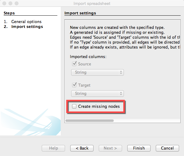
4. Gephi will prompt you to choose a CSV file to import. In Gephi, you have to import both a ‘Nodes Table’ and an ‘Edges Table’ separately. Start with the Nodes table:
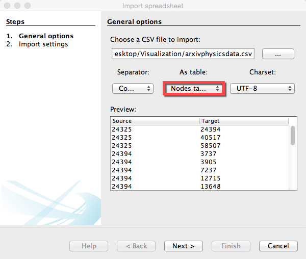
Choose your data file; specify that your data is separated by commas and that it is a nodes table. Then click “Next” and “Finish” to create the nodes. To add edges to the nodes, repeat this process again, only this time, select “Edges table” instead of “Nodes table.” When you click “Next” for the edges table, make sure that the last box is left unchecked, because you have already imported your nodes.
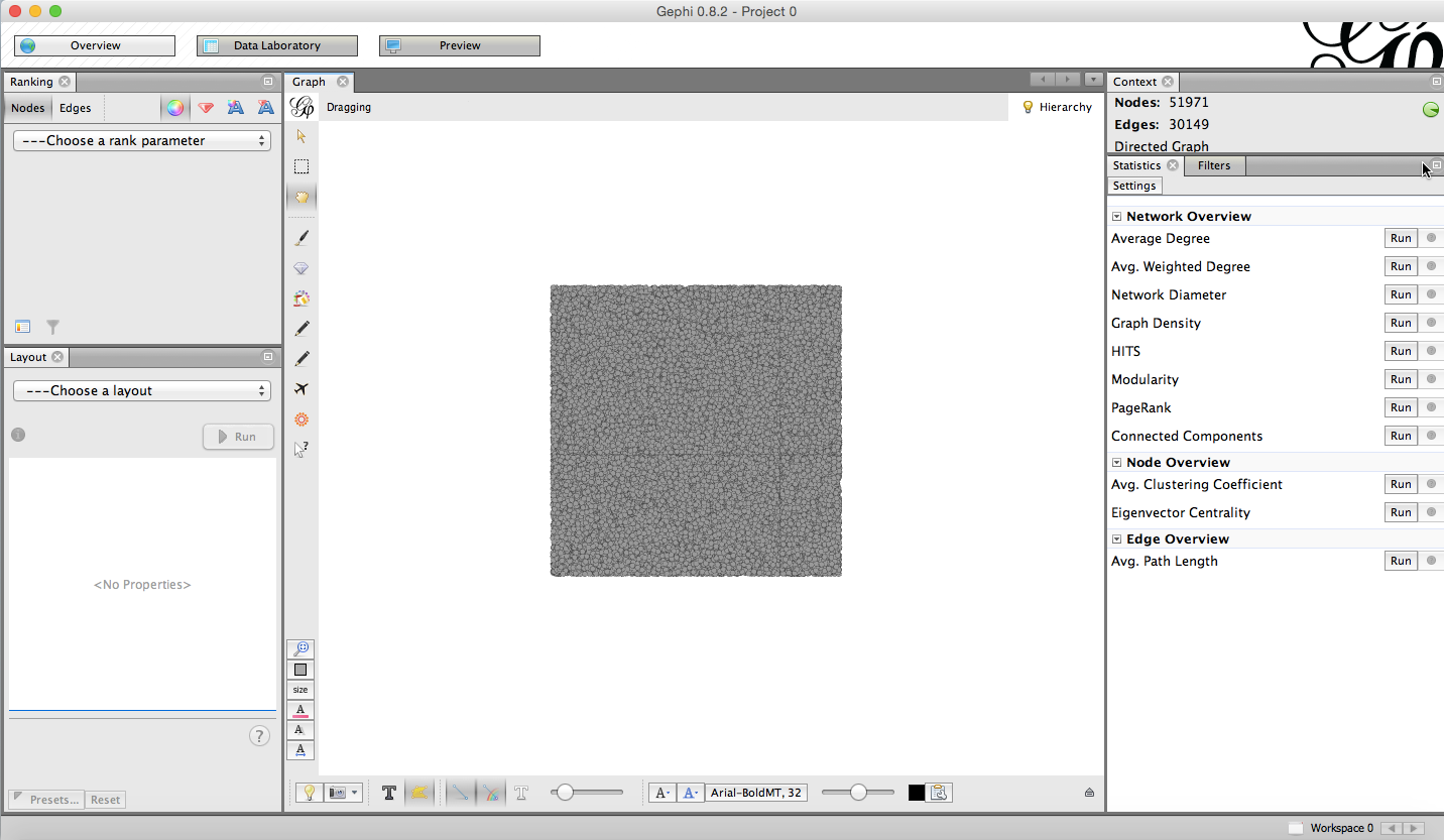
5. Go back to ‘Overview’ (the button to the left of ‘Data Laboratory’).
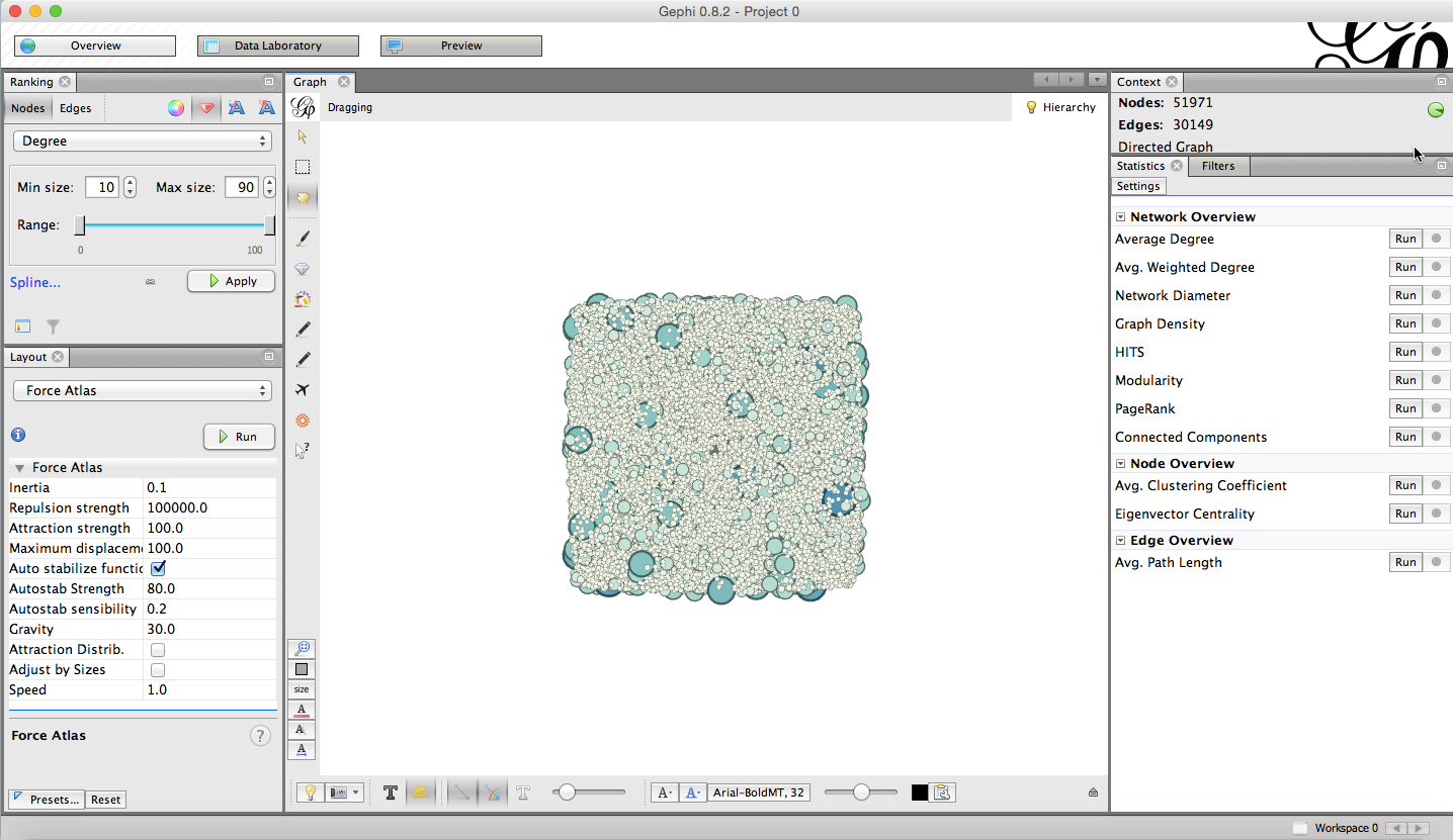
6. If you don’t see a graph, go to ‘Window’ and select ‘Graph’ from the drop-down menu. (Select ‘Layout’ as well if the layout window is not open on the side.) You will initially see a square-shaped cluster of nodes like this:
CREATING A VISUALIZATION IN GEPHI:
1. To the left of the ‘Graph’ window, you will see a ‘Layout’ window with selection of possible visualization layouts.
2. Choose ‘Force Atlas;’ set the repulsion strength to 100,000 and the attraction strength to 100. Set the maximum displacement to 100 as well. Click ‘Run’ and you will be able to see the visualization taking shape in real-time.
 For certain layouts in Gephi, the visualization will run indefinitely, and it is up to the user to decide when to stop the algorithm. Others will stop automatically. For further reading on specific layouts provided below, you can go to the following Gephi tutorial.
Styling your visualization in Gephi:
Effective network visualization is as much an exercise in design as it is an exercise in analysis; it’s up to you to decide which discoveries you would like to use your graph to highlight. As a mentioned earlier, the Gephi interface also provides a window for generating various statistics about the network. The statistics window employs technical terms used in network analysis, making the ‘learn-and-play’ curve favorable to users who are new to network analysis and visualization.
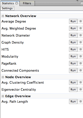
One of the terms from the window above that we will be using in the section focused on styles below is degree. The degree (or valency) of a node refers to the number of edges it has.
To set colors and styles in Gephi:
1. In the ‘Ranking’ window, select ‘Nodes,’ click the red diamond icon, and choose to rank by degree.
2. Enter a minimum value of 10 and a maximum value of 90 to visually represent degree by node size.
3. Then select the color spectrum icon, and choose a spectrum to visually represent the degree by color as well as size.
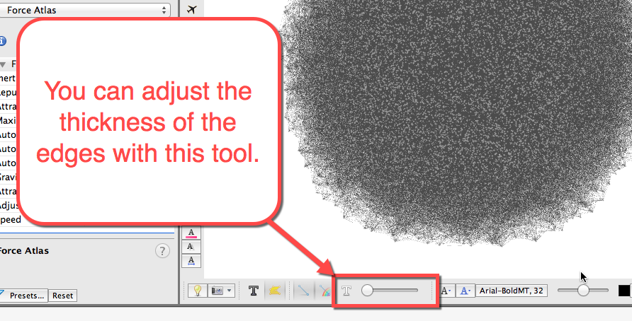
4. If you click the ‘Edges’ tab beside ‘Nodes’ in the Ranking window, you will see you can similarly adjust the coloring of the edges by weight, which could be a good tool to use when visualizing a weighted (or valued) network, a network where the edges have values assigned to them.
Teasing out communities in a network with Gephi:Martin Grandjean’s Introduction to Gephi shows that you can employ a combination of the layouts Gephi provides to shape the network visualization in such a way that it becomes more easily readable; however, each method will be fairly unique to each dataset.
Now that we’ve covered preparing and uploading the dataset to Gephi as well as basic styling options and layouts, we will move on to Part 2 and learn about the same processes in Cytoscape.