
This post is the second half of a two-part beginner’s introduction to network visualization. The first post outlined preparing a dataset for upload into Gephi and covered how to get started with the styling options and layouts available in Gephi. In this half of the tutorial, we’ll do the same for Cytoscape.
UPLOADING DATA TO CYTOSCAPE
To begin, go to http://www.cytoscape.org/download-platforms.html and download version 3.2.1 of Cytoscape to your computer.
After running the installation, open the program:
1. Choose ‘Empty Network’ under ‘Start New Session’ in the Welcome Window.
2. Click OK for default selections in the ‘Create New Network’ window.
3. Go to File –>Import–>Network–>File and select the CSV file you created for the High Energy Arxiv Physicists’ dataset in the first part of the tutorial.
4. A window titled ‘Import Network From Table’ will appear. In the section marked ‘Interaction Definition,’ select the appropriate columns so the color coding for Source Interaction, Interaction Type, and Target Interaction matches your data columns.
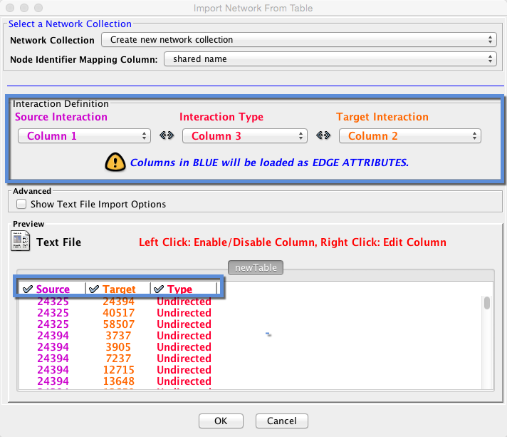
5. Check the box next to ‘Show Text File Import Options’ under ‘Advanced’ to change the delimiter to ‘comma’ if your data is not formatted the way the table appears above.
6. We have no column in blue because our edges for this dataset are not weighted (they do not have values assigned to them).
7. Click OK to upload the dataset. Similarly to Gephi, the data will appear in the graph window as a grid:
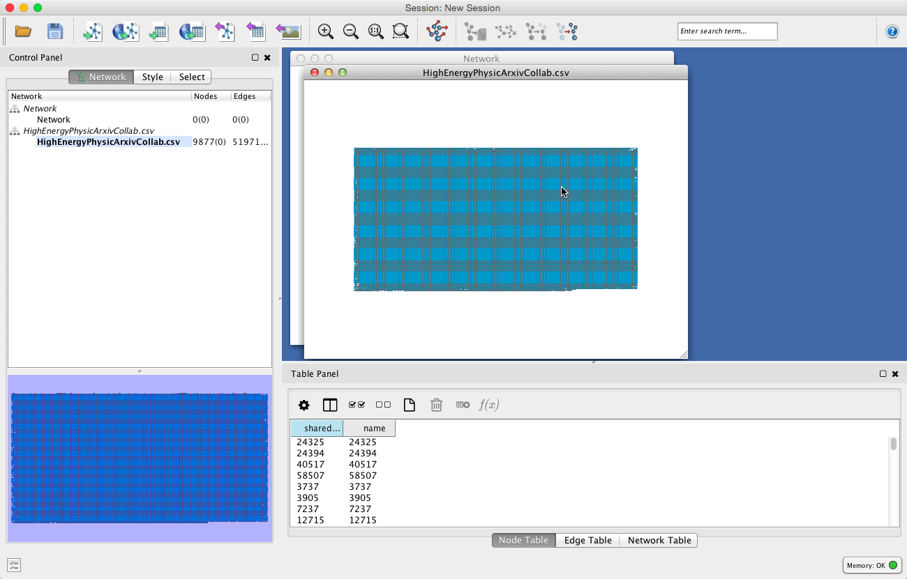
Unlike Gephi, in Cytoscape there is no separate ‘Data Laboratory’ tab. Everything appears in one window, within different panels.
The Table Panel on the lower right lets you see the attribute information for nodes, edges, and the network. You can modify the columns that appear by clicking the column icon to the right of the gear wheel and checking the columns you want to appear in the table panel.
The panel to the left of the Table Panel is the Navigation Panel. It provides an overview of the whole body of the network and allows you to see where in the whole the Network View Window (upper right panel) has zoomed.
CREATING VISUALIZATIONS IN CYTOSCAPE
Keyboard shortcuts for exploring the dataset:
There are some fun keyboard shortcuts in Cytoscape to use to explore your dataset through selection, either while it is in grid form or in another layout. First, select a node.
Then hit Command + 6 (Control + 6 for Windows). This will show all other nodes with edges immediately connected to the selected node.
Finally, hit Command + n (Control + n for Windows). Cytoscape will create a new window displaying only the selected cluster of nodes.
You can track the names of the nodes you have selected by displaying the column ‘Selected’ in the table panel, then clicking the gear wheel icon and checking the option ‘Show selected.’
Layouts and styling in Cytoscape:
Cytoscape offers its own unique selection of layouts, which are different from the ones available in Gephi. This Cytoscape tutorial contains a listing and commentary on the the different kinds of Cytoscape layouts appropriate to helping you explore different facets of a network dataset in section 3.3, “Laying Out Your Network.”
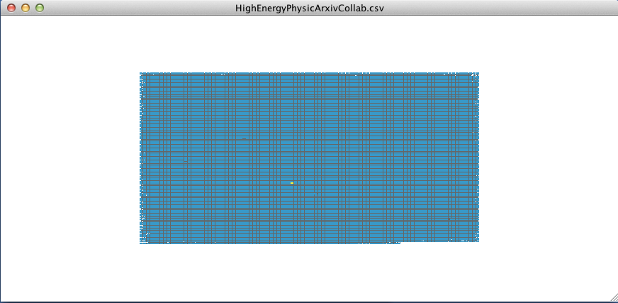
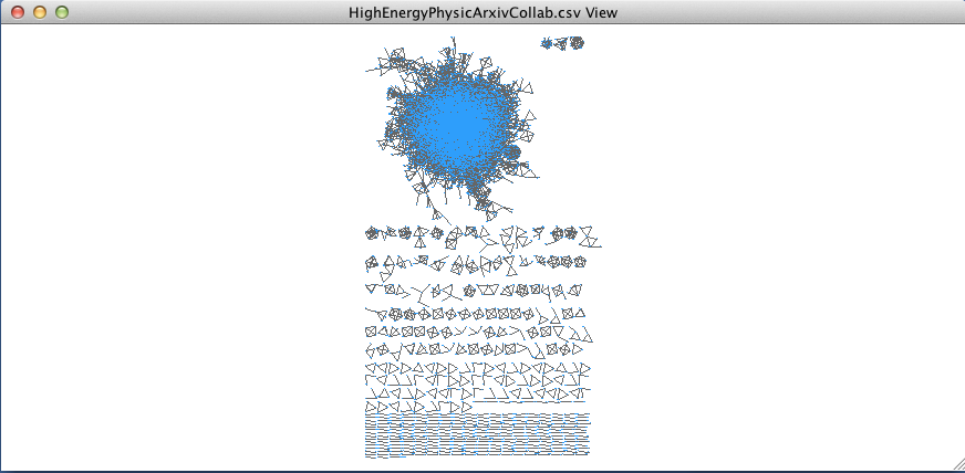
For our dataset on collaboration among Arxiv physicists, we’ll run the Prefuse Force Directed Layout. To run the layout algorithm, go to Layout –>Prefuse Force Directed Layout –> Edge Betweenness. The result will look like this:
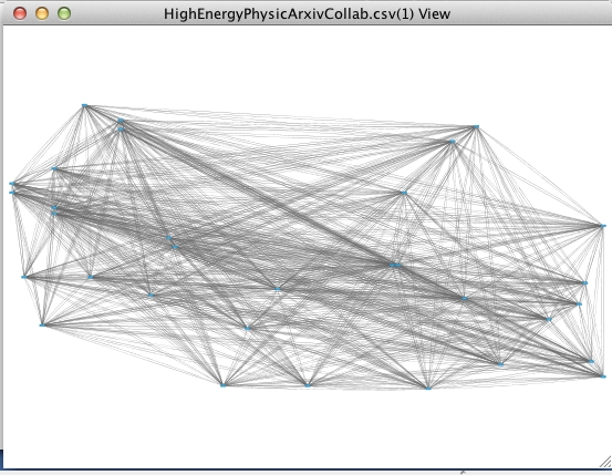
However, you may have already noticed, I’ve already changed the color of the nodes to a lighter blue…here’s how to start changing the colors in Gephi. Go to the Control Panel and click on the tab “Style.” You’ll notice that the panel actually has two sets of tabs to navigate, both along the top and the bottom of the window:
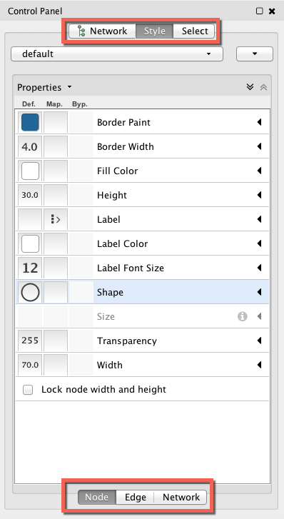
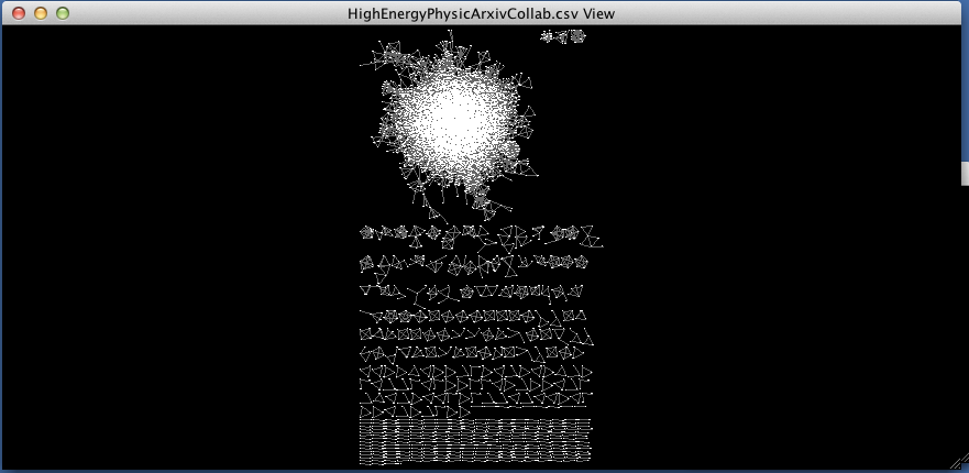
The tab along the bottom, Node — Edge — Network, will allow you to fine tune the colors, shape, thickness, etc. of the nodes, edges, and network. For example, if you wish to change the background, you’ll want to click on the ‘Network’ and change the ‘Background Paint’:
Getting away from controlling appearance and getting back to adjusting the actual shape of your network graph, at first glance, it would appear that Cytoscape gives the user less control over parameters than Gephi. In fact, in Cytoscape, this feature is still there, the interface is just a little less intuitive. If you go back to Layout –> Settings, a window will appear prompting you to choose your layout, and will then provide a display permitting you to adjust the parameters specific to the algorithm you chose as you see fit:
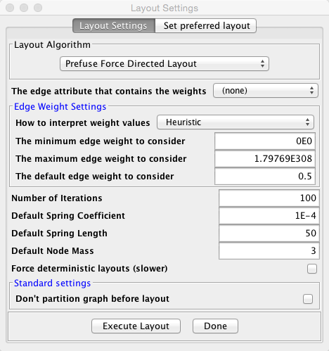
Here we see the default spring length for our graph was 50. If we change it to a lower value, the nodes will be more closely packed together in our graph.
Unlike Gephi, Cytoscape will not show you the nodes shifting and the visualization graph taking shape as the algorithm runs. There are also no layout options that run indefinitely until the user chooses to stop the algorithm. Apart from this main difference, however, there are still opportunities for the beginner in network analysis and graph design to learn analysis terminology while playing with a dataset in Cytoscape. The ‘Statistics’ interface is just not as readily apparent as in Gephi, but there is a similar feature in Cytoscape called “Network Analyzer.”
Getting Statistics through Network Analyzer:
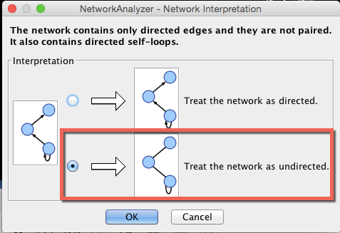
To launch the Network Analyzer, go to Tools–>Network Analyzer–> Analyze Network.
When the “Network Analyzer-Network Interpretation” window appears, choose to treat the edges in this dataset as undirected:
Cytoscape will run an analysis on the dataset and display the metrics for the network in a new panel called the results panel. You can ‘pin’ this panel in the larger Cytoscape window if you wish to keep it on hand as you explore the dataset and work on your graph or you can choose ‘Save Statistics’ to save the values for as a .netstats file.
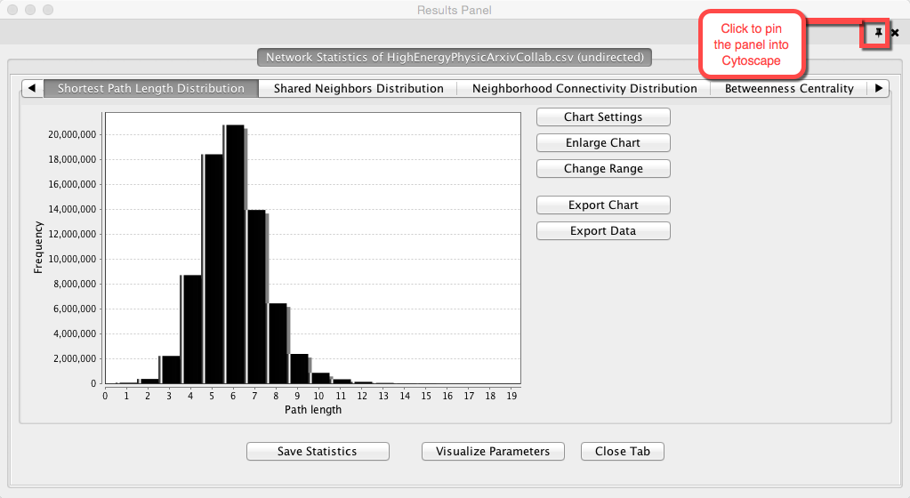
There is also the option of incorporating values from the results panel into your graph. If you click on “Visualize Parameters,” a new window will appear that will provide you with options of styling either your nodes or edges by size, thickness or color according to the parameter of your choice.
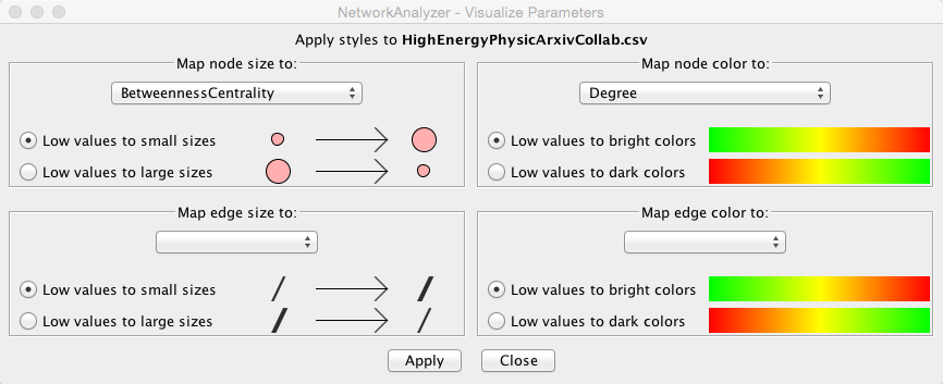
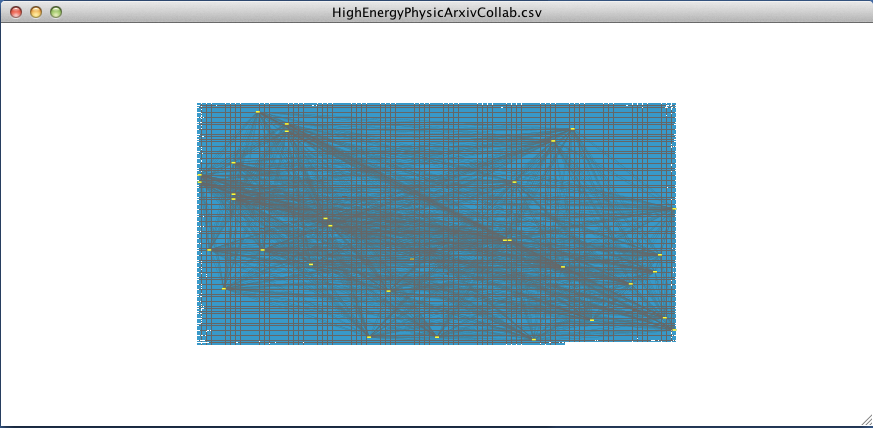
When we choose BetweennessCentrality to map to node size and Degree to map to node color, the result should look something like this (I also modified the background and the edge colors using the menus from the styling tab as reviewed earlier):
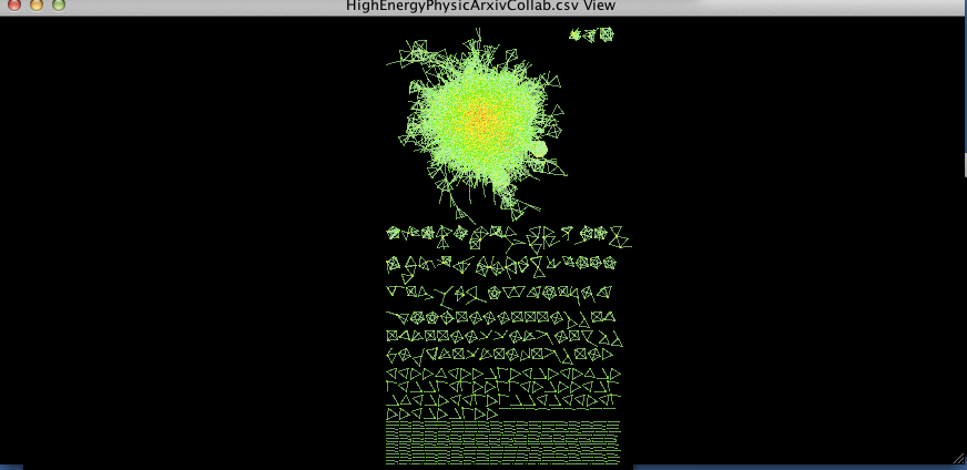
figure 1.
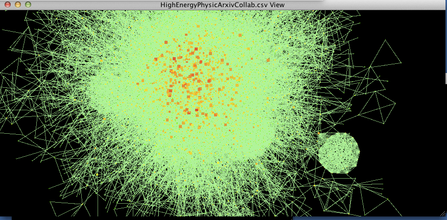
figure 2.
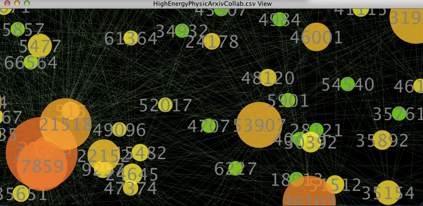
figure 3.
As we zoom in closer to the nodes, you can see that numbers have been mapped onto the nodes. These are the ‘names’ of the nodes. If you click on a node and then look at the Table Panel, you will be able to see the exact statistics for the selected node.
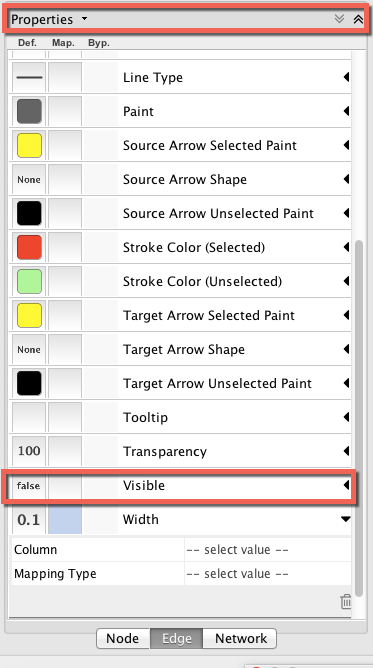
With regard to the first two figures above, if I were to decide I wanted to focus on the nodes and eliminate the edges from my graph (which are obscuring my view of the nodes), I could go back to the ‘Style’ tab in the Control Panel, go to the ‘Visible’ property for edges, and change the settings from ‘true’ to ‘false.’ (If you can’t see the ‘Visible’ property, click on ‘Properties’ and check ‘Visible.’
The result is shown below (this is a partial/zoomed view into the main cluster of the dataset):
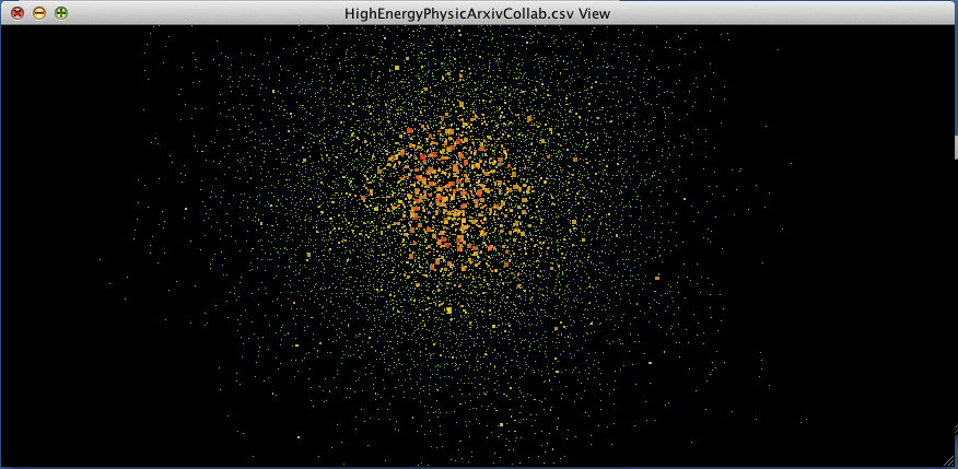
Voilà, the nodes are no longer obscured by the edges!
INTRODUCTION SUMMARY
In this introductory tutorial to network visualization in Cytoscape and Gephi, we essentially covered :
1) how to upload a dataset
2) how to create and style network visualizations
3) how to adjust settings for layout algorithms
4) how to calculate and look up metrics on both platforms.
Overall, the Gephi interface is a bit more intuitive and accessible if you’re new to network visualization and the discipline of network analysis, insofar as it allows you to watch graphs take shape while algorithms run and quickly run simple statistics. Cytoscape is less intuitive, but if you’re interested in doing an-depth study of a network dataset, Cytoscape’s Network Analyzer is a highly powerful and useful feature.
One thought on “Introduction to Network Visualization: Part 2 (Cytoscape)”