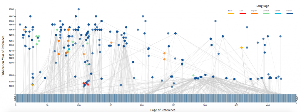
Jacques Derrida is one of the major figures of twentieth-century thought, and his library – which bears the traces of decades of close reading – represents a major intellectual archive. The Princeton University Library (PUL) houses Derrida’s Margins, a website and online research tool for the annotations of Jacques Derrida. We used data collected from this project to create visualizations of the references used throughout Derrida’s De la grammatologie.
In this interactive visualization for Derrida’s De la grammatologie we represent each book referenced (nodes) and the locations where each book is referenced in the work (lines connecting nodes to the x-axis). The x-axis represents De la grammatologie from start to finish, and the y-axis represents the years in which each referenced book was published. The color of each node indicates the language in which each referenced book was published, and the position of each node is an averaged position among the pages at which the node was references in De la grammatologie. A brush tool is implemented along the x-axis to select ranges of De la grammatologie and references made within the selected range. By mousing over each node, the book title, author, and publication year are displayed.
This code can be adapted to create an interactive visualization for any data set, either for book references or another type, which includes many entries, an x-axis location for each entry, a y-axis location for each entry, and information to display with the mouse-over feature. The interactive and visual components are most interesting when entries are not discrete, and can be connected with a significant frequency to many locations along the x-axis.