Bibliographic Networks: A Python Tutorial

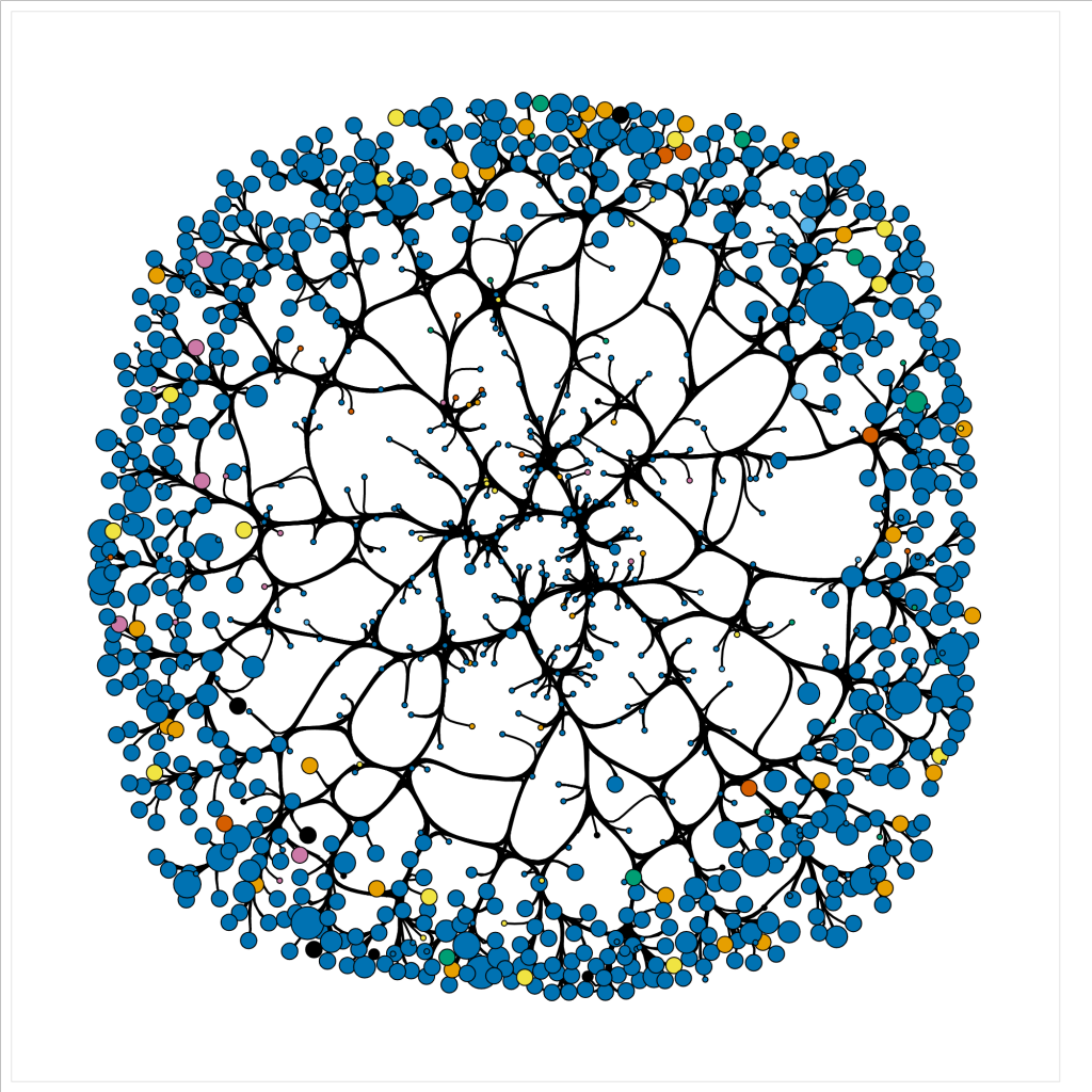
Networks can provide significant measures to identify data driven patterns and dependencies. Though, given a data file it can be difficult to discern how one may approach creating such a network. In this tutorial, we will use a bibliographic data file downloaded from a query search in Scopus to walk through the process of cleaning the data file, writing a python script to parse the data into nodes and edges, computing graphical measures using NetworkX, and creating an interactive network display using HoloViews.

We tried out multiple Python libraries for ease of use and efficiency before landing on this combination. Building a network was more intuitive in NetworkX than iGraph. However, it took several minutes to render our large graph and a interaction was sticky. Pyvis was easy to build a network with and can be expanded to incorporate more advanced NetworkX functionality with only a couply lines of code. However it still took a long time to render, with slow manipulation. Holoviews, which runs on top of the native Python visualization library Bokeh, enables NetworkX to render quickly, with versitile manipulation. The graphs are produced in HTML and JavaScript for easy integration into webpages.

About Colaboratory

While we originally developed this script in a local notebook, we found that running it through Google’s cloud-based Jupyter notebook environment Colaboratory is a smoother option, particularly for nacent coders. We encountered version conflicts between the dependencies when setting up a local notebook environment that were bipassed in Colab. Colaboratory allows you to use and share Jupyter notebooks from your browser, without having to download, install, or run anything on your own computer. Notebooks can be saved to Google Drive, Github or downloaded locally. This code contains OAuth2 functionality to access data from Google Drive, with a link to instructions for access from Github. A single line of code adapts the script render in Colab.

To open the notebook in Colab, click on the notebook from the repository list. GitHub will open a preview, click this iconImage of Logo from the top of the notebook to open directly in Colaboratory. (If the preview doesn’t load, you may have to disable your ad blocker.) Alternatively, you can clone or download this repository and put in Google Drive. Google Drive will recognize the .ipynb notebook file format and give you the option to open in Colaboratory.

2018 International Football TransferMarket Visualization in Bokeh

The goal of this project is to scrape and crawl through multiple pages of TransferMarket.com and create an interesting Bokeh Visualization. The data was scrapped using BeautifulSoup and compiled into a SQLite database. Then SQL queries were constructed and the query results were loaded into a Pandas to allow for easier data manipulation. Finally, that data was loaded into Bokeh to create a Scatter Plot that explores the relationships between a soccer teams A) Average Squad Age B) 2018 Squad Market Value and C) Number of Foreign Players found in each Squad.

Tidyverse dplyr and ggplot2: How to Manipulate and Visualize Data Easily in R

R is a popular programming language and free software environment for statistical computing and visualization. The language and software is widely used among statisticians and data miners for developing statistical software and data analysis. This tutorial is designed to give the reader a quick start on their journey with R. The intended audience is someone with a basic understanding of data analysis and programming languages. The tutorial is mainly divided into two parts: Data manipulation and visualization. The data manipulation portion explains how to use base R functions and the dplyr package to clean, reformat, subset, and summarize the data in various ways. The visualization portion explains how to use the ggplot2 package to create interesting visualizations of the data that was manipulated. The tutorial clearly explains the common uses of each function by applying them to a focus dataset. Thus, the code from this tutorial can be adapted for data manipulation and visualization for any data set.

Derrida: Visualization of Derrida’s Margin in D3

Jacques Derrida is one of the major figures of twentieth-century thought, and his library – which bears the traces of decades of close reading – represents a major intellectual archive. The Princeton University Library (PUL) houses Derrida’s Margins, a website and online research tool for the annotations of Jacques Derrida. We used data collected from this project to create visualizations of the references used throughout Derrida’s De la grammatologie.

In this interactive visualization for Derrida’s De la grammatologie we represent each book referenced (nodes) and the locations where each book is referenced in the work (lines connecting nodes to the x-axis). The x-axis represents De la grammatologie from start to finish, and the y-axis represents the years in which each referenced book was published. The color of each node indicates the language in which each referenced book was published, and the position of each node is an averaged position among the pages at which the node was references in De la grammatologie. A brush tool is implemented along the x-axis to select ranges of De la grammatologie and references made within the selected range. By mousing over each node, the book title, author, and publication year are displayed.

This code can be adapted to create an interactive visualization for any data set, either for book references or another type, which includes many entries, an x-axis location for each entry, a y-axis location for each entry, and information to display with the mouse-over feature. The interactive and visual components are most interesting when entries are not discrete, and can be connected with a significant frequency to many locations along the x-axis.