
Part 2: Writing and Visualizing the Data Narrative
In contrast to the tens of thousands of records associated with the collection as a whole, the Bentley Student Scrapbooks consists of 88 scrapbooks documenting student experiences at the University of Michigan spanning the 1860s to the 1940s, with most scrapbooks falling between about 1906 to 1919. These scrapbooks covered a fascinating cross-section of life on campus – everything from student athletics to cross-dressing to secret societies to dance cards appeared in the Subjects field of the metadata.
When I asked the (admittedly naive) question “what do you mean by scrapbooks?” the archivist team had a lot of stories to share. For instance, I had no idea that a fraternity in 1910 might keep track of their beloved top athlete in painstaking detail and then put it all into a scrapbook for posterity. It was genuinely lovely to experience their enthusiasm about this collection, which often focused on specific backstories to the creation or legacy of these scrapbooks that fell outside the metadata itself. How then, I wondered, might a data visualization narrative support these passionate archivists in their public lectures and workshops? What types of patterns should we focus on revealing?
As we finished up the meeting, I noticed that a few themes emerged in what the archivists were drawn to: the unique convergence of topics in the scrapbooks, how the prominent themes of campus life changed over time and between decades, and the relationship of the creator/subject’s gender to the scrapbook content. These themes mapped well to the metadata we had available, and questions about change over time fit naturally with the beginning and ending decade data, which afforded easy comparison across discrete blocks of time.
While we were no longer building a network visualization with edges and nodes, the concept of the connectedness of subjects ended up influencing our approach to the second round of visualizations. The data could show us not merely which subjects were popular in a certain decade, but what subjects tended to coexist together. What types of subjects tend to appear alongside “cross-dressing” in a given scrapbook? What about “commencement”? These relationships provided a way to describe the context of particular themes within the scrapbook – which might, in turn, suggest interesting questions about the context and convergences of certain themes of student life at particular historical moments in the University of Michigan. Subject connectedness and similarity became one of the central features of the narrative we constructed with the data.
Generating the narrative: charts, graphs, and text
With Justin’s guidance, I again set about writing several scripts to separate out the subjects, count their frequency, and enumerate each convergence between topics in a given scrapbook (this time further separated out by decade). I decided to use Tableau at this point in the process because it allowed me to move quickly from exploring the data to showing trends via tidy chart outputs (bar, bubble, area, etc.)
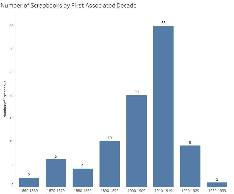
Here is an overview of the scrapbooks in the collection, which spans the 1860s to 1930s:
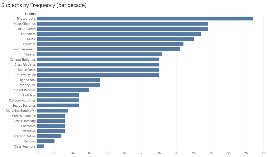
And the most popular subjects across scrapbooks (counting multiple decades as distinct):
If we break the subject popularity down by gender, we see significant differences between men and women:
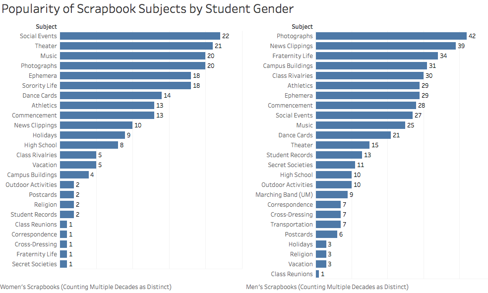
Of the top five scrapbook subjects for men and women, only Photographs appear in common (#1 for men and #4 for women).
From our overview, we moved into closer exploration of a few scrapbooks in the collection, in particular seeking to contextualize their scrapbooks within the collection as a whole. One such scrapbook belonged to Margaret Henkel. From the online resource guide:
“The Margaret Henkel scrapbook documents student life from 1914-1917. The scrapbook includes athletics (football, track and field), music, social events, dance cards, student records, news clippings, theater, holidays, campus buildings, vacation, postcards, commencement, and ephemera.”
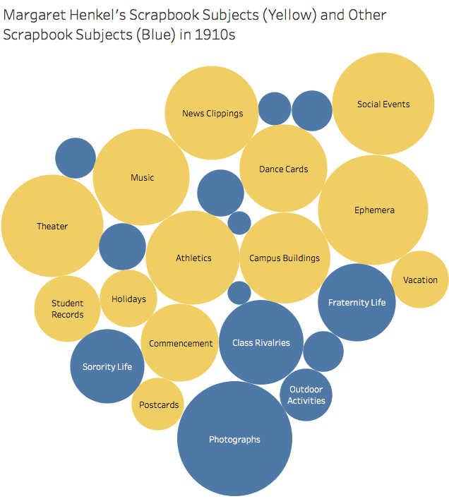
As this (fairly cluttered) bubble chart shows, Henkel’s scrapbook covers a diversity of subjects – in fact, her scrapbook includes the 2nd highest number in the collection (13 subjects), second only to Donald Crandon Miller (14 subjects).
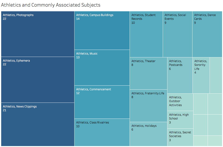
What types of research questions might the collection afford us to ask about these particular subjects? One subject that appears in the scrapbook is athletics (according to the online resource guide, the scrapbook covers football, track, and field):
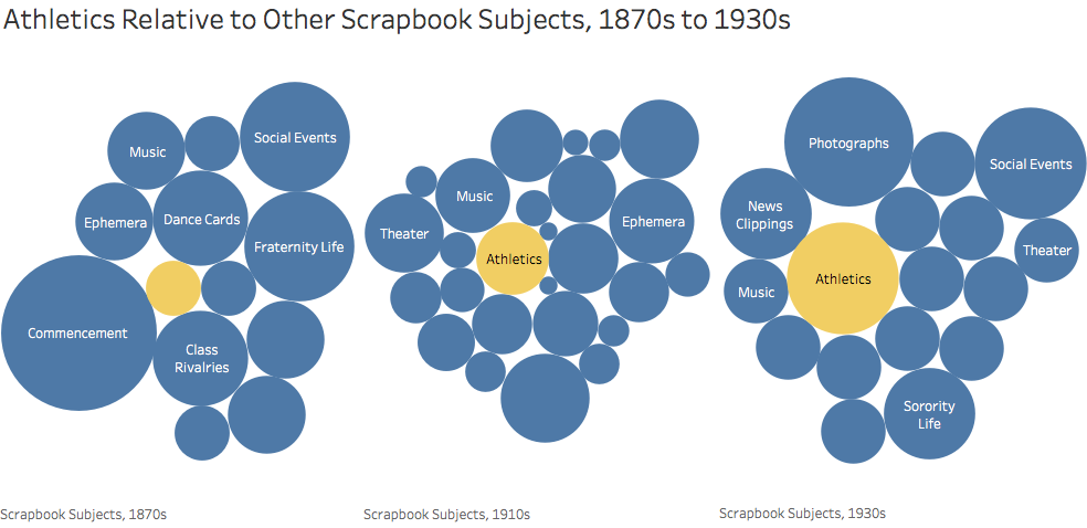
Athletics appears infrequently in the oldest scrapbooks in the collection (circa the 1860s) but plays an increasing role over the decades. Henkel’s scrapbook was written in the 1910s and thus appears in the middle of this trend.
Scrapbooks that cover athletics also frequently correlate with scrapbooks that use photographs, ephemera, and news clippings:
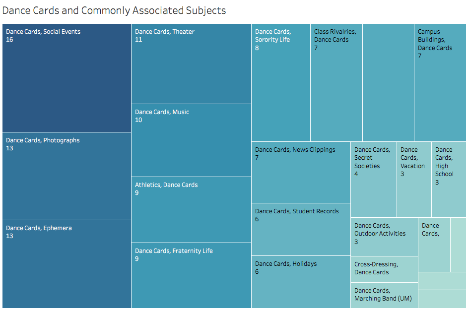
 Associated subjects may provide insight into the context in which a subject might have been discussed or presented in a student scrapbook. For example, in contrast to athletics, dance cards commonly appeared alongside social events, photographs, ephemera, theater, and music:
We took these and a half-dozen other visualizations of similar styles and embedded them within a written narrative that explored the scrapbook collection. The narrative moved from an overview of the collection and questions of gender and subjects into exploring one particular scrapbook creator’s focused subjects and the transformations of subjects over time. Our goal was to generate text that would fit right into a lecture or workshop, either as a fully-formed narrative or as a set of modules to excerpt from easily.
Completing the Narrative with Heat Maps
When we arrived at the end of the narrative, it still felt that something was missing. In our last consulting meeting, the archivist team had mentioned it would be helpful to refer the audience to other closely related items in the collection. This had the benefit of encouraging a researcher to take further action, without distracting from features like online search.
In order to calculate relatedness, I wrote a new script to generate a matrix of all possible pairings of scrapbooks (88 by 88) and to score those connections based on every possible subject – one point for both scrapbooks discussing a subject, zero points for both scrapbooks omitting a subject, and -0.25 points for inclusion in one and exclusion in the other. This allowed us to generate a handy list of the 15 most closely related scrapbooks for each scrapbook in the collection.
I was curious how we could use these lists to dig deeper into these close relationships between the scrapbooks. Did these convergences in closely-related scrapbooks reveal anything new about the patterns of related groups or clusters of subjects in the collection? To find out, I generated two matrices for two different scrapbook creators. Each matrix consisted of binary values for every possible subject – a one for inclusion and zero for exclusion – set against rows the most closely-related scrapbooks.
Justin suggested that we show the results of these closely-related scrapbooks as heatmaps. After working through a helpful R tutorial, I generated a visualization for Emile Reed Low and seven closely related scrapbooks:
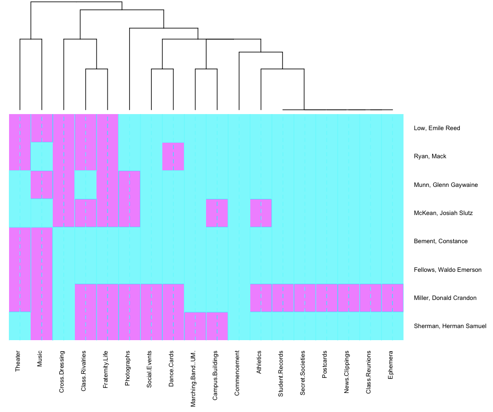
Heatmaps are useful for revealing patterns like clusters of subjects. For instance, in the Emile Reed Low scrapbook, theater, music, cross-dressing, class rivalries, and fraternity life all appear together, which evokes a fascinating image of particular events or communities that may (hopefully!) catch the attention of a researcher interested in any number of subjects.
While the area maps shown earlier are helpful in showing connected subjects relative to a single subjects, these heatmaps show cluster of subjects relative to a single subject and its closely related counterparts in the collection. The heatmaps helped close the narrative with a call to action – go and investigate these particular creators if you’re interested!
Whether the heatmaps would inspire a specific research question or not, my goal was to capture some of the unexpected and nuanced aspects of the collection data. My hope was that in doing so, I would further the Bentley’s goal of getting folks curious and engaged with collections like the Michigan student scrapbooks. I felt the heatmaps brought the narrative to the tidiest close I could manage (I’m still learning how to wrangle all these tools!) and so I submitted the graphics and text to the client team.
Reflections on the Consulting Process
This was a semester full of exciting new tools and tactical missteps and geekiness. I am fortunate to have the chance to learn by doing in this manner – and I think my experiences speak to some of the difficulties and opportunities in finding the story within the data.
Perhaps the most significant aspect of the project was the shift from network analysis and graphical searching approaches to a narrative-driven deep-dive into a much smaller subset of data. I wonder whether more conversations on the front-end of the planning process would have helped clarify the scope in such a way that more time could have been spent crafting the data visualization narrative for the scrapbooks. On the other hand, going through the process of generating a variety of visuals helped both us and the archivist team to reflect on what patterns and insights might be gleaned from the data.
While each data visualization tool required climbing a different learning curve, wrangling new syntaxes and GUIs, etc., I ultimately found the work to progress most clearly when I saw tools as only the last step in a process beginning, most significantly, in the desired learning outcome and relationship with users. I also found that the process of wrangling the data directly – understanding the fields in the JSON, cleaning strings and making sure data types behave properly, writing Python scripts to generate matrices and scoring systems, etc. – to be the most time-intensive step of the process. Cytoscape, Tableau, and R each took time to get to know, but they appeared much later in the workflow and served much more specialized purposes. I imagine as I go forward, I’ll continue to learn more about data visualization workflows and toolkits, and this first project provided a good starting point to contextualize those steps.
Going through the process of crafting a data visualization narrative allowed me to test and ultimately reject a handful of assumptions, and create something with (hopefully) greater utility for our audience. Along the way, I also enjoyed learning more about what the archivist found exciting in their data. Our conversations about scrapbooks helped me understand what kind of curiosity the team wanted to spark in others, which in turn influenced my visualization narrative at every step. (And discovering a new approach to geeking out about history is also a lot of fun.)
One thought on “From Networks to Scrapbooks: A Case Study of Data Visualization Consulting (Part 2)”