
Part 1: Finding the Story in Data
Introduction
When you set out to tell a story with data, how do you determine its scope and focus? What kind of relationship do you want to cultivate between your viewers and the data being visualized? If there is a “best” or “most effective” story lurking in the data for the audience at hand, how do you pick it apart from the others?
Data visualization refers to a set of tools and practices, but also a deeper struggle to find a way to craft meaning from representations of reality, and share that meaning with others via narrative. In this post, I’ll explore how I grappled with identifying and framing a data visualization story in the context of a semester-long consulting project with the Bentley Historical Library.
The Bentley
According to the Bentley’s website:
The Bentley Historical Library collects the materials for and promotes the study of the histories of two great, intertwined institutions, the State of Michigan and the University of Michigan. The Library is open without fee to the public, and we welcome researchers regardless of academic or professional affiliation.
The Bentley is home to a massive, diverse trove of items spread across 11,000 collections. When the Bentley reached out to the Digital Project Studio last fall, they had a central goal in mind: helping researchers understand the collections better, and engage with these collections in ways beyond the affordances of simple keyword searches or browsing alphabetical lists. They hoped data visualization could provide something special to spur that process – a new kind of insight or way of interacting.
Early Attempts: Linked Data for the Entire Collection
When I joined the project in the Winter 2017 semester, the Bentley team had suggested that our visualizations start with linked data for the collection.
In a collection of resources (in this case, archival documents like collections of photographs, documents, etc.), metadata is used to track the unique features of each document such as the creator’s name, the title, and so on. Curators often add additional linked data tags to track attributes that might be shared across many resources and worth querying in their own right. For the Bentley collection, linked data existed for individuals, families (especially historically significant families in Michigan), and institutions (such as University departments, nonprofits, churches, etc.). While this metadata is attached to most resources in the Bentley collection, there is currently no way for a researcher to access specific linked entity data from the search or browse features.
After receiving a substantial JSON dump of the resources in the collection, along with associated JSON for linked agents, I sought out ways to express something unique and compelling in the linked data (and asking myself questions like: do certain pairings occur again and again? Do all photographs of a certain type run through one infamous family!?)
At this phase of the process, I had already formed assumptions about how certain technical affordances would lead to the end of “increased engagement”. In particular, I assumed that network visualizations and interactive charts hosted on the library’s website would lead users to explore more and engage with the collections differently. I also assumed that linked data would lead to the kinds of insights that would be helpful for those imagined online patrons. And beneath both of those assumptions was the belief that the audience of “researchers browsing online” was the appropriate audience in the first place.
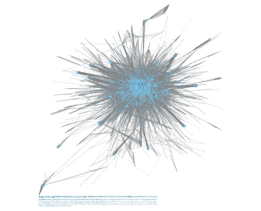
From here, I studied the metadata structure using a JSON browser until I understood how linked agents functioned in the data. I then wrote a Python script that would list out connections between linked agents as edges between nodes. (This was a new concept for me: Imagine a single record with four linked agents – this record can be thought of as showing evidence of connections between agent 1 and 4, 2 and 4, 3 and 4, 2 and 3, 2 and 4, and 3 and 4. This is like if you counted every possible transfer you could make at a subway stop where four lines converge).
Thinking about the interconnectedness of linked data helped us to ask new questions of the data – like which linked agent is most central to the collection? What are other linked agents that tend to appear in a cluster or neighborhood of this network? What is the overall shape of the collection? Generating a node-edges style list provided data to feed into the network analysis software package Cytoscape.
Below is a very early draft of the network visualization, which is missing some of the force directed physics calculations necessary to make it easily readable:
I wrote a second script that would tally the occurrences of linked entities, along with the frequencies of subjects and non-linked metadata. I imported these data into Tableau in order to create a series of bubble chart visualizations:
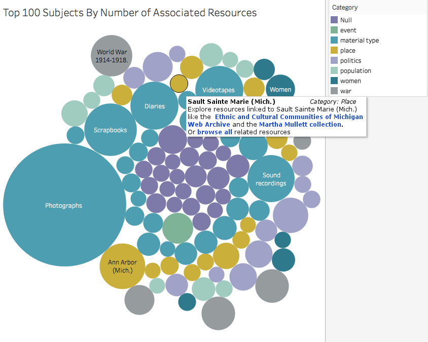
One benefit of Tableau is that you can quickly create static visualizations. For visualizations with interactive elements like the one I hoped to build, Tableau allows you to share charts with dashboard features like filtering via its free (proprietary) hosting service, Tableau Public. I hoped an interactive web application built around visualized metadata could live on the Bentley’s website and provide a graphical browsing/discovery experience for researchers.
Shifting focus
When Justin and I presented the network visualization and interactive bubble chart prototypes to the Bentley, we quickly realized the outputs we had generated didn’t match the actual audience and vision of engagement. While the network visualization provided a rough overview of the data as a whole, it did not create a clear sense of action steps or engagement for researchers. And while the bubble chart web app prototype provided a pathway for a specific online browsing interaction, the archivist team though that an interactive visualization competing directly with search or browse functionality would be confusing or distracting for most users.
In our meeting, I took a step back and shifted from presenting my particular outputs to taking on a more facilitative and active listening role. I wanted to better understand what research engagement looked like from the perspective of the archivists – what actions would signify successful engagement?
Archivists at the Bentley often engage with researchers and students in workshops, class visits, and lectures. It was in this instructional context that our clients imagined visualizations could be most helpful. Our clients hoped to use our outputs as a tool to communicate more about the diverse collections at Bentley and inspire further exploration by the researchers, such as through a future in-person visit to the library. The anonymous website visitor we imagined engaging via an interactive visualization was actually not the primary user at all – instead, we were designing for an educator intimately familiar with the collection.
Perhaps we could look at just one collection, a member of the archivist team suggested. This would bring the scope of the project down a couple of orders of magnitude – from a meta-analysis of a heterogenous collection of collections into a deep dive into the nuances of a single collection. Another archivist threw out student scrapbooks as a candidate for the deep dive. Several members of the team had been talking about the scrapbook collection recently in workshops and public talks — it would be nice to have something to point to in those situations, some set of visualizations to help researchers understood what types of stories and experiences were captured in these scrapbooks, and what types of research questions they might help answer. A few members of the team agreed to clean up the scrapbook metadata and send over a new JSON file.
This, in retrospect, was the critical turning point in the project. Instead of starting from a set of technical affordances (linked data, networks and interactive visualizations), we were beginning with a particular audience (workshop/lecture attendees and student researchers) and outcome (increasing awareness of the diverse Bentley collections and interest in engaging further) in mind. The visualization and analytic techniques we sought out from this point would be in service of exactly this audience and outcome, and (hopefully!) come from a point of greater clarity.
Continue to Part 2: Writing and Visualizing the Data Narrative