The second cohort of data visualization interns are off and running here at the Digital Project Studio. They will be sharing the projects they are working on very soon. But, as they are getting up to speed, I want to take a minute to reflect on learning about data visualization and technology in general. Recently, in our Tech and Texts seminar series, we read some selections of Wilkinson’s The Grammar of Graphics (an interesting book which formed the basis for the R plotting library ggplot). He begins with an insightful reflection on the difference between graphics and charts:
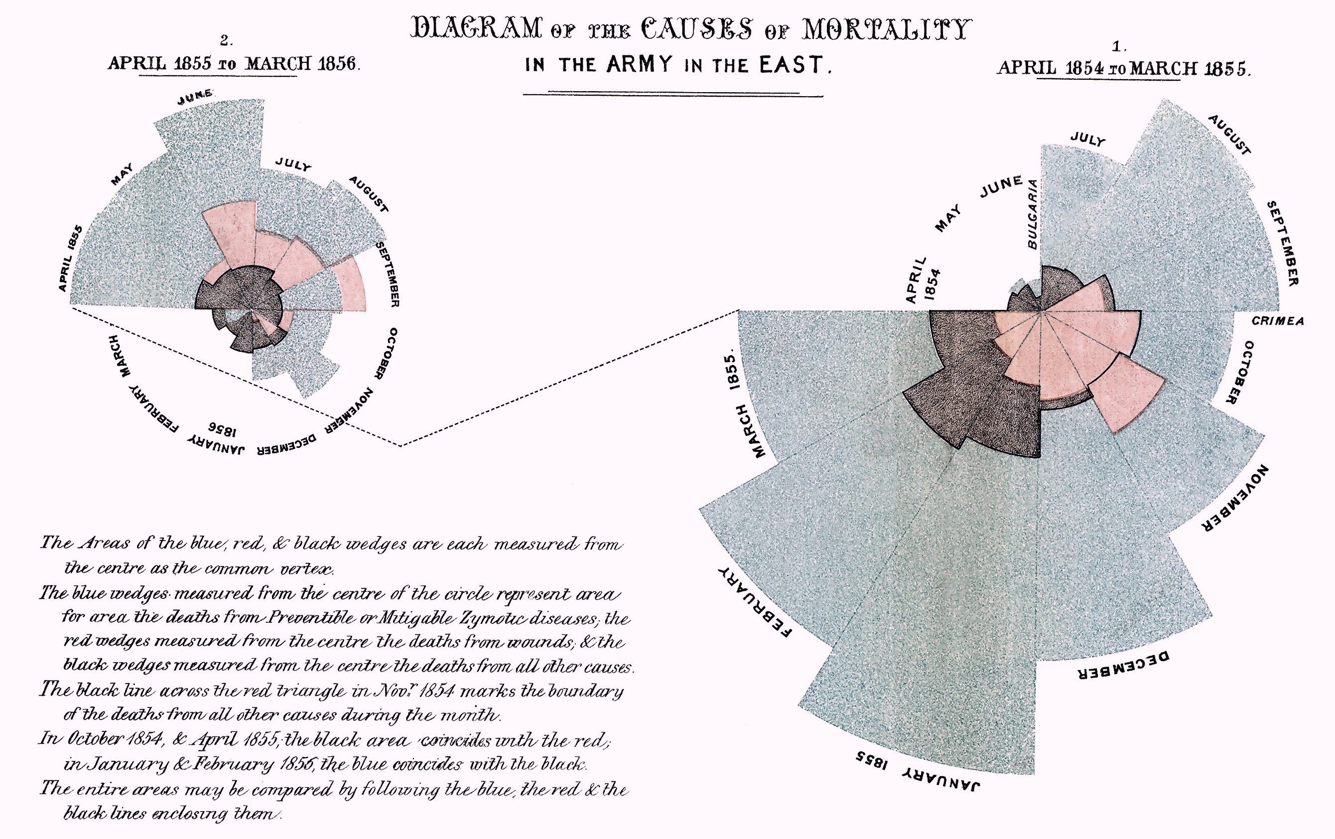
We often call graphics charts (from χάρτης or Latin charta, a leaf of paper or papyrus). There are pie charts, bar charts, line charts, and so on. This book shuns chart typologies. For one thing, charts are usually instances of much more general objects. Once we understand that a pie chart is a divided bar in polar coordinates, we can construct other polar graphics that are less well known [for example Florence Nightingale’s famous visualizations of mortality seen below-JJ]. We will also come to realize why a histogram is not a bar chart and why many other graphics that look similar nevertheless have different grammars.
There is also a practical reason for shunning chart typology. If we endeavor to develop a charting instead of a graphing program, we will accomplish two things. First, we inevitably will offer fewer charts than people want. Second, our package will have no deep structure. Our computer program will be unnecessarily complex, because we will fail to reuse objects or routines that function similarly in different charts. And we will have no way to add new charts to our system without generating complex new code. Elegant design requires us to think about a theory of graphics not of charts.
Wilkinson touches on an important truth here that extends far beyond graphing and charting, namely that so much work with data, technology, visualization, etc. offers opportunities to learn a few examples or to learn by creating deep mental structures and habits of thinking. The former (e.g. learning how to make a bar chart and a histogram) is essentially the excel approach to data visualization and the latter (e.g. learning a grammar for mapping data to space) amounts to an approach that is agnostic to the tool that is used whether it is pen and paper or R. As Wilkinson hints in relation to software packages, learning charts may be easier at first but as one tries to do more and more it becomes increasingly complicated and disorganized. We up walls and barriers down the road. On the other hand, if we learn ‘graphics’ and a flexible structure for describing graphics, the work is very challenging at first (often appearing unnecessarily so) but then gets easier and easier as we build upon it. While Wilkinson may be talking about creating a program, this is true of one’s individual learning about data visualization.
So, along with this year’s interns, I am looking forward to building, coding and creating data visualizations as well as ways of thinking about data, visualization and technology. Stay tuned…